Visual Identity Design for "TechForge"
I created the complete visual identity and graphic design for TechForge, a company that specializes in computer hardware. The color palette was carefully selected to reflect the balance between technology and bold visual impact. We combined black, pink, purple, and subtle hints of blue to create a modern and distinctive look. While blue is a common choice in the tech industry, we used it minimally to avoid predictability and instead focused on more vibrant tones that help the brand stand out.


Brand Identity Development "Astrobyte"
For Astrobyte, an indie game studio, I designed a vibrant and character-driven visual identity. The brand is built around a lively combination of bright pink and orange, chosen to reflect energy, creativity, and fun. At the heart of the identity is a custom astronaut mascot that embodies the studio’s spirit of exploration and limitless imagination. From color and typography to character design, every element works together to create a playful, memorable brand that stands out in the gaming world.


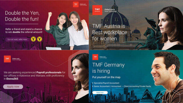
TMF Group – Employer Branding Design
As an Employer Branding Intern at TMF Group, I supported the graphic design needs of the global employer branding team. My work included creating visual assets for internal and external campaigns, such as social media posts, infographics, presentation materials, and digital content aligned with TMF Group’s brand guidelines. I contributed to enhancing the company’s visual identity and helped communicate the employer brand consistently across multiple channels.


Visual Design Assets for Great Place to Work Sweden
For the Great Place to Work project in Sweden, I created a variety of visual materials including social media posts, banners, roll-up designs, and custom Teams backgrounds. The aim was to ensure a consistent and engaging brand identity across all platforms, combining creativity and functionality to deliver clear, professional, and visually appealing communication.


Visual Design Assets for Great Place to Work canada
For the Great Place to Work project in Canada, I developed a range of visual materials, including social media graphics, banners, roll-up displays, and custom Teams backgrounds. The goal was to maintain a cohesive and engaging brand identity across all channels, blending creativity with practicality to deliver clear, professional, and visually appealing communication.


Visual Design Assets for Great Place to Work Paraguay
For the Great Place to Work project in Paraguay, I designed a variety of visual materials such as social media graphics, banners, roll-up displays, and custom Teams backgrounds. The objective was to create a consistent and engaging brand presence across all platforms, combining creativity and functionality to ensure clear, professional, and visually compelling communication.


Print & Office Design for TMF Group
I created a range of branded materials with a focus on marketing flyers for the LATAM region, targeting the Americas, including the U.S., Canada, and Latin America. Additionally, I designed various office-related items such as employee ID cards, planners, and mouse pads, ensuring consistency with the company’s global brand identity.


Brand Identity Development "Galerija abstraktum"
Designed the visual identity for Gallery Abstraktum’s modern art exhibition, using a palette of purple and white to evoke a sense of elegance and mystery. The use of a sans-serif font emphasized modern minimalism, while the overall composition aimed to create a magical and immersive atmosphere. The project focused on balancing simplicity and emotional depth, allowing visual elements to communicate the abstract theme.


Creating the Visual Identity for "Galerie Zeitfenster"
For Galerie Zeitfenster, a contemporary art gallery based in Berlin, I designed a refined and expressive visual identity. The color palette is built around soft pastel pinks, complemented by a deeper rose tone to ensure readability of white text. The backgrounds feature textured paint-inspired colors, symbolizing the tactile and emotional nature of art. A classic serif typeface was chosen to evoke elegance and timelessness, aligning the brand with the gallery’s curatorial vision.


Brand Identity Development "brand kraft"
Brand Kraft’s identity was designed to communicate innovation with clarity and strength. I used a dark navy blue as the foundation, contrasted with a vibrant red infused with magenta tones to create visual energy and modern appeal. At the center of the identity is a creatively drawn lightbulb symbol, representing bright ideas and originality. The overall look is clean yet dynamic, striking a balance between professionalism and creativity.


Creating the Visual Identity for "triglav"


Brand Identity Development "galerie farben"
Galerie Farben is an art gallery with a vibrant and creative visual identity. The color palette mixes deep blue-green shades with lively tones of red, orange, green, and blue, reflecting the dynamic and diverse nature of the art they present. This colorful blend brings energy and originality to the brand, making it fresh and inviting while celebrating artistic expression in all its forms.


Brand Identity Development "Velvetbite"
Velvetbite is a chocolate brand that blends elegance with a handmade touch. The use of a serif font gives the brand a refined, timeless feel, while the illustrated chocolate details on the packaging add personality and a sense of craftsmanship. This combination creates a unique and approachable identity that invites customers to enjoy a delicious, artisanal experience.


Visual identity for "LowSugar" App
LowSugar is an app designed to help users track the glycemic index of foods with ease. The visual identity features a calming blend of lavender purple and vibrant orange, creating a balanced and engaging contrast. The logo creatively incorporates the letter "O" in LowSugar as a heart shape, symbolizing care and health. This color palette and design approach convey both trust and energy, aligning perfectly with the app’s mission to support healthier choices.


Visual Identity Design for "Wandrelust Brew"
Wandrelust Brew is a coffee brand with a relaxed and inviting visual identity. The design features a casual, easygoing font paired with coffee cup stain elements that add a personal, handcrafted touch. Earthy tones reminiscent of coffee beans and warm aromas create a cozy and authentic atmosphere. This identity captures the essence of comfort and passion for great coffee in every detail.


Brand Identity Development "zlatna loza stanković"
For Zlatna Loza Stanković, a wine producer, I created a distinctive brand identity that avoids generic design clichés. The logo features a fox’s head, symbolizing sophistication and cleverness. Wine glass stains are incorporated as graphic elements to subtly represent the company’s craft. A clean sans-serif font completes the look, balancing modernity with elegance and reinforcing the brand’s unique character.


Visual Identity Design for "slast"
Slast is a bakery brand with a warm and approachable visual identity. The logo features a circular design incorporating wheat elements, symbolizing freshness and quality ingredients. The overall look is simple yet inviting, reflecting the wholesome and handmade nature of the bakery’s products.


Visual Identity Design for "tea harmony"
Tea Harmony is a tea brand with a refined and elegant visual identity. The logo features a teapot icon that conveys sophistication and warmth. A clean sans-serif font complements the design, creating a modern and approachable look that reflects the brand’s dedication to quality and harmony in every cup.


photoshop art
Product manipulations created in Photoshop that serve as creative exercises and foundations for product design. They can be transformed into polished visuals ideal for social media advertisements, combining imaginative concepts with effective visual storytelling to engage audiences and highlight design versatility.


